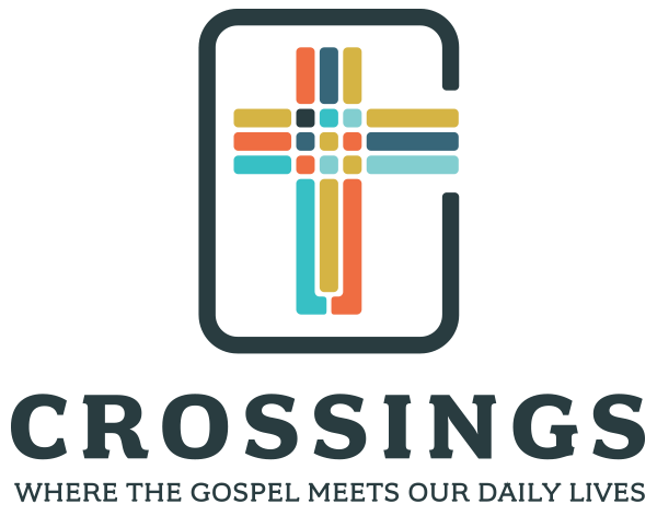
Our Visual Identity
Crossings can mean many things to many people: it’s a community, a preaching resource, a method of looking deeply into Scripture and applying it to daily life for everyone – both clergy and lay people. The new visual identity was designed with many of those things in mind.
When designing the emblem for the new Crossings visual identity I wanted to infuse some of these concepts, and what you see might be different, and that’s okay, even to be expected. Overall, I wanted to create something that could stand the test of time and also be something basic enough so that a child could replicate it out of construction paper. This logo signature had to be something that could be used online, in print, or even embroidered on a polo. I wanted it to feel like something from the front of the Lutheran Book of Worship, or from the front of the Bible. After interviewing co-founder Ed Schroeder for our film project along with extensive talks with Sherman Lee, I realized that the part of the method wasn’t just the grounding or the tracking, but the crossing – where grounding meets tracking – and when Ed explained it, he was extremely animated. It was all about action, moving forward. Other things that I considered in designing the new emblem were soft approachable corners, and the idea of the “sweet swap” of God’s grace exchanging for our sins, represented as a “U” with us sinking down to our deepest points, and God meeting us there and helping us cross over and back up.
What has come of the emblem design was, of course, the cross, keeping the idea of three elements. You’ll note the bottom of the cross has a U-turn design to follow the methodology and at the center are individuals representing the community of Crossings. To enclose the cross we have a “C” container which provides room for the cross to break out from itself (and its symmetry) moving us forward. Using different tonalities and colors helps represent different global cultures and perspectives as well as give us that stained glass-like homage to our church sanctuary roots. And lastly, the color palette was rendered in a modern and relevant scheme to attract a younger and diverse audience. The typeface was designed to strike a balance between tradition and modern. The Crossings system is based upon 2000 years of Christian theology and simultaneously, our aim is to proclaim and apply those teachings to our everyday lives.
I’m very excited for Crossings and the Crossings Community to have these tools to communicate The Message to viewers around the globe.
Brandon Wade
Mighty Megaphone
September 2017


You must be logged in to post a comment.